UI controls so we can see stuff
Not a long message this time, I just wanted to get some quality of life changes in so we could actually see stuff.
Where is this at?
Version 0.0.2:
So now we have some pictures:
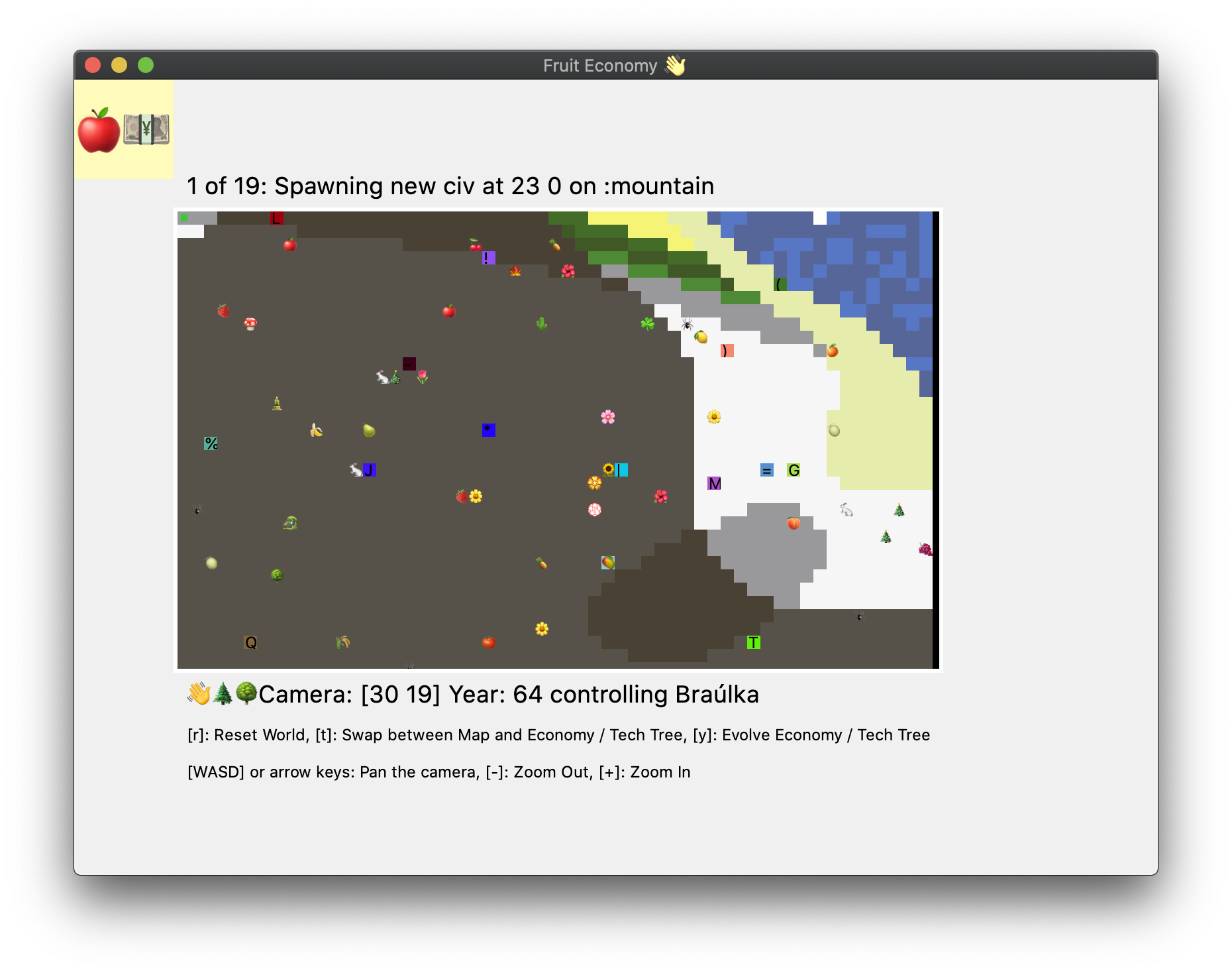
Yes, I'm aware it's not that exciting, but I wanted to make space for buttons appearing underneath it. So I thought I'd add in some space so that I could stick them in.
Now if you look at the map and compare it with the image below, you'll see that it's zoomed in.
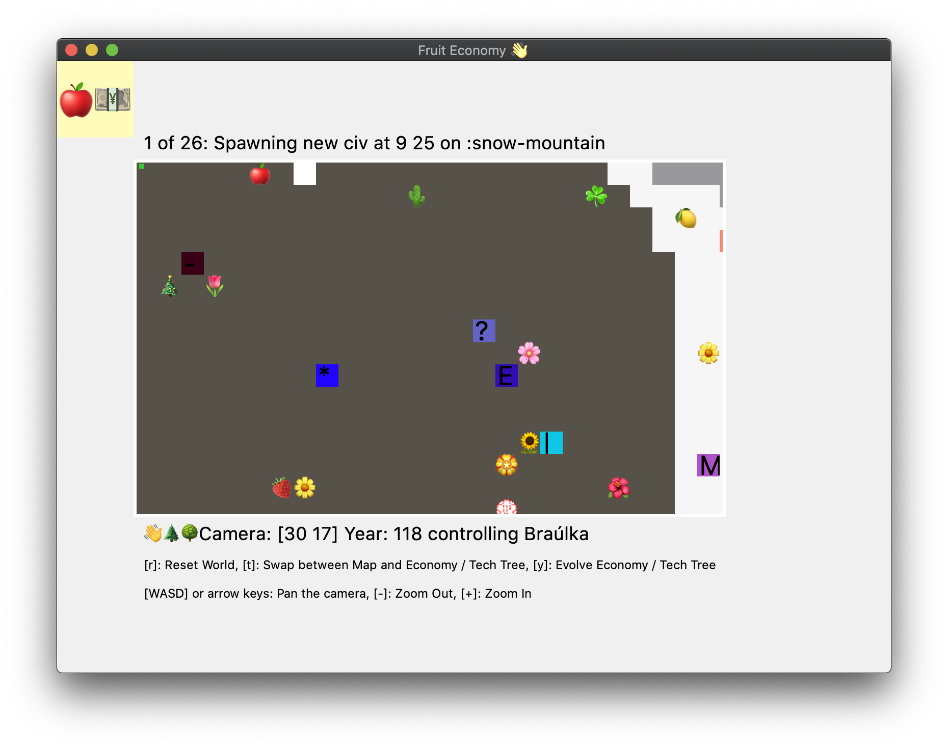
Similarly we can do the same for the Tech Tree / Economy View.
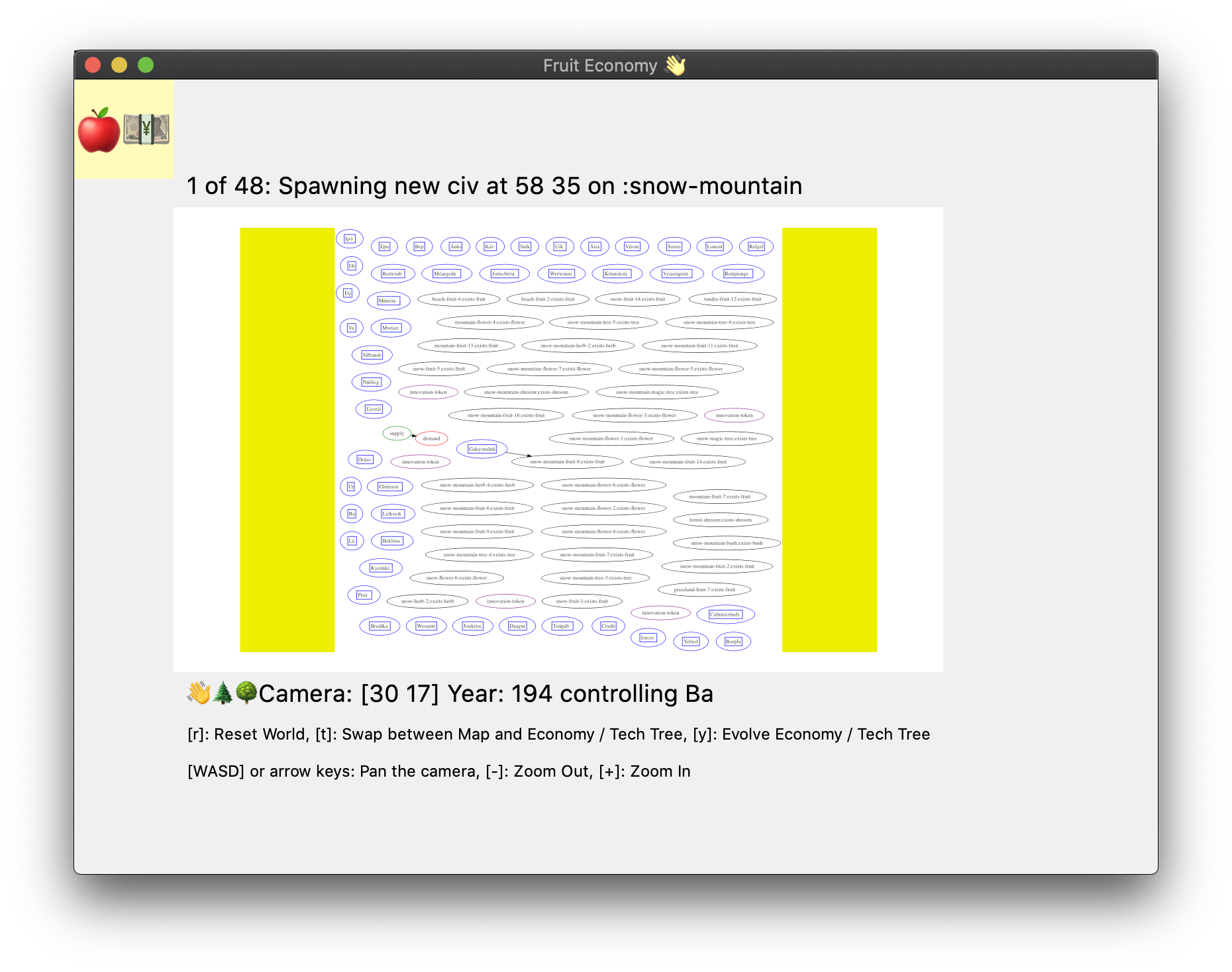
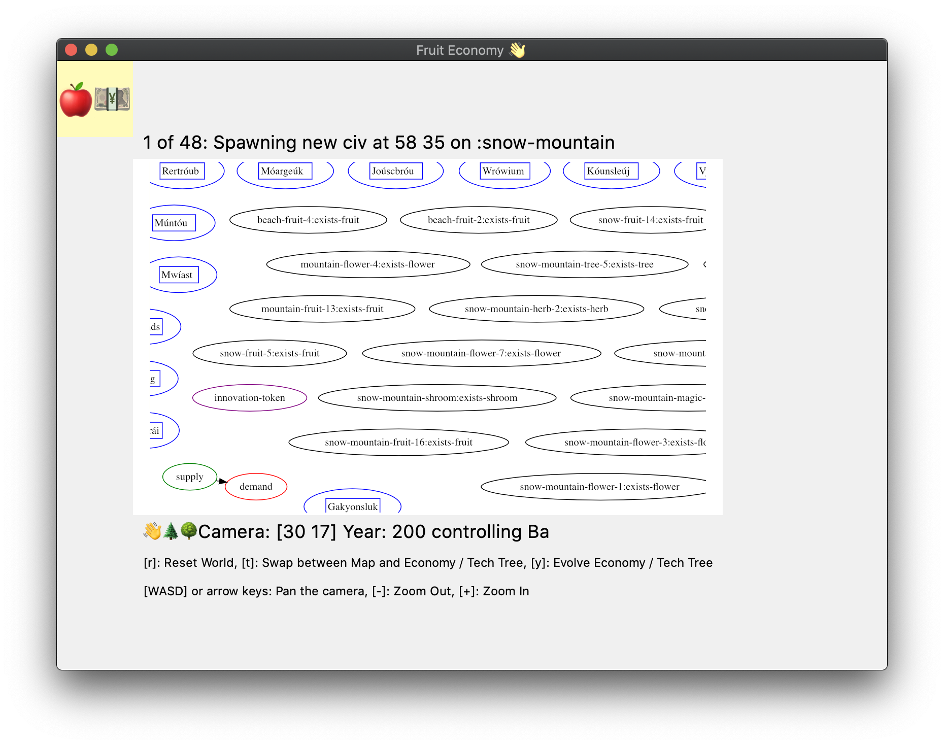
Zoom in both views using - / + buttons. I don't actually test for the shift at the moment, so you can just hit the button without actually pressing +.
You can also use WASD or the arrow keys to pan the Map around as well as the Tech Tree / Economy View.
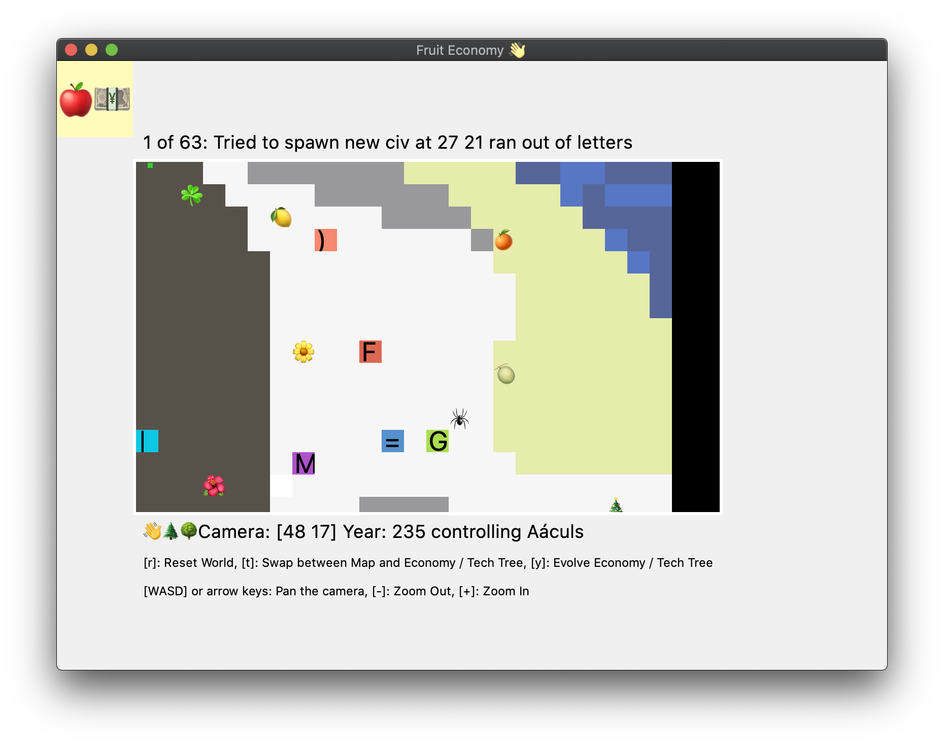
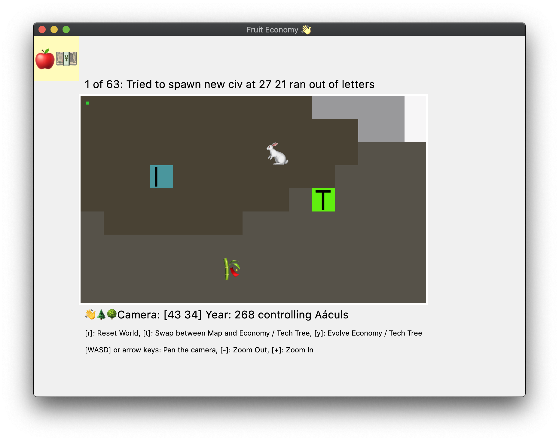
You probably noticed these in the prior images, but some small critters are now moving around the map, at the moment they're just there to test simple movement behaviour and to have something to look at.
It's not a lot I know and there's more to be done, but I was getting a little frustrated by not having much in the way of decent controls, so I decided to add some in.
Files
Get Fruit Economy
Fruit Economy
A toy playing around with simulating maps, civilisations and their economies
| Status | Prototype |
| Author | folcon |
| Genre | Simulation |
| Tags | 2D, Economy |
More posts
- Some moving pictures are shownJun 03, 2022
- Finally added a Player, well, sometimes...May 22, 2022
- Pulled in basic bits from 7DRL 2022Mar 27, 2022
- 7DRL 2022Mar 12, 2022
- Agents making choices, oh my...Feb 12, 2022
- Just launching thisJan 30, 2022
Leave a comment
Log in with itch.io to leave a comment.